Sorry for the late update...
there will be a lot of post from today,
so enjoy~~
~Typography Section~
Today we are having a typography section with Paul.
What I think about this section is more like doing copybooks. But it was fun~ I enjoy it.

First task of the section is that we need to cut the paragraph out and rearrange the paragraph by not adding space between the words.

As you can see, if we stick all of them together, it wont make any sense, so we separate some of the words to make the paragraph more understandable. But by the way I read the text... i still don't understand it, and it doesn't make sense as well...
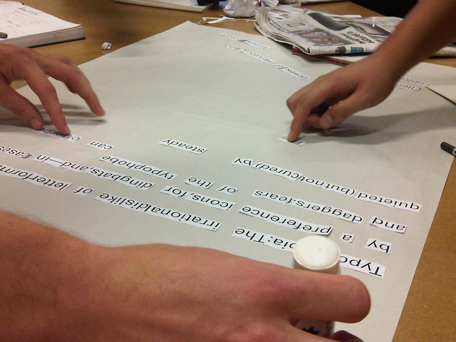
Cutting and sticking it down take quite a long time to do it because the glue was so dry... We were thinking about which words should we put gaps or not... this part wasted a lot of times... even if you put spaces or not, its not going to make sense anyway...

What did I say~~ I still don't understand this paragraph at all... It just doesn't make sense.

Then we have a powerpoint presentation about different effect in typography, then he told us to use one letter in the alphabet and create some similar outcome towards those examples.

This is what i did in class, even thou its not finished, but I think I have done quite a good job in this piece. It wasn't easy to fill in the negative space with a fine marker pen... it take ages...

These are the works that the others did in the lesson, even thou they didn't finished it on time like me, but they look great on the wall.

This person doesn't care about the time, He/she spend his/her own time and effect in these piece and the outcome was good, the image is interesting and it must take ages to do these design...

If we got more time in this piece of work, i think he/she can finished it on time, he/she only need to shade the negative space of the K thats all, so he/she must be really good at typography to create all these great pattern out in such small amount of time.

Section two~ we need to use those different words on the top right corner and put same in each box with different meaning in it. Those meanings in those box are texture, colour, scale, composition, repetition, reduction, order and reflection.

nearly most of the student got misunderstand what they need to do, but using one words isn't that bad at all~~ If the affect is good, than it will be fine. I quite like this one because its quite creative~~

This isn't all of the work we produce... There are most on the other side of the wall~~

I quite like how the U was putted inside the P on the third image. its simple but affective.

This is an interesting design~~ drawing a figure sitting on top of the words as a chair and having a cigarette. I am thinking is it appropriate to do this in this exercise~~

I like it how the words start fading at the end of the letters and the tone of the letters are amazing as well, this is a really good design.
No comments:
Post a Comment