Here are some example of
my Gdf Research

Business card 1: front

Business card 1: back

Business card 2: front

Business card 2: back

Sketchbook idea 1

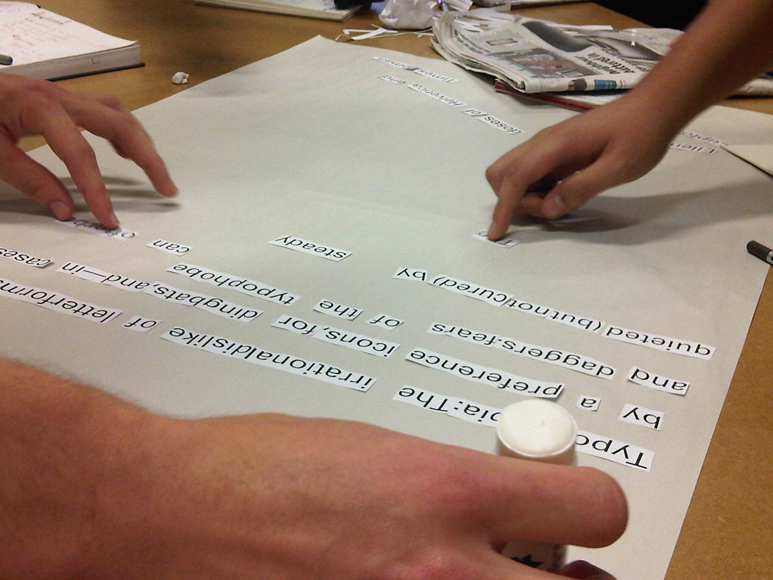
Sketchbook idea 2

Sketchbook idea 3

Map of culture
1. | 1. Culture describes a set of values that a particular group of people share. These values manifest themselves in traditions, clothing and practices. | |
2. | 2. identity | |
3. | 3. Culture is the values and attitudes that are shared by a group of individuals that collectively make up a community. | |
4. | 4. It creates a feeling of peace in life. | |
5. | 5. The distinctiveness of a race or group | |
6. | 6. Culture is the main factor that affects a persons bringing up, and this will affect the persons physical, mental and intellectual characteristics. | |
7. | 7. to learn more about the difference between other countries and my own. | |
8. | 8. The collectuon of beliefs, values and traditions of an unique racial group | |
9. | 9. culture means the way of thinking, doing things, and style of dressing. | |
10. | 10. different country, history background | |
11. | it means everything, and history, | |
12. | 11. I like the definition "The way we do things round here" | |
13. | 12. Spirit, Because Spirit so to Learning about text, language, geography, music, literature, painting, sculpture, drama, film, etc. | |
14. | 13. Culture means different customs, belief and behaviour pattern, | |
15. | 14. The ability to appreciate the finer things in life, but also to know the lower points as well. | |
16. | 15. A histoy, identify that country or style. | |
17. | 16. where you come from, the country, traditions foods and festivals and religions that go with the lifestyle there. | |
18. | 17. Heritage | |
19. | 18. Culture is the different ways that people live their lives, the different values they impose on things, the different views that they have on the world and on how the society should be ran. | |
20. | 19. unique | |
history, a person's soul | ||